Refactoring Web UI — Making Great First Impression For IEEE MUJ Home
As I'm currently pursuing User Interface Design by University of Minnesota, I thought, why not give it a try as opposed to my gut feeling (brain's telling me, our plate is currently full dude, remember that software release you have to do, or those two papers you have to finish writing and ..., the list goes on for a while).
I was also persuaded by my IEEE Student Local Chapter seniors because well, they want to compete in this year's IEEE Student Branch Website Contest (Global & Regional) and well, I'm also ...

So there's that.
Before we start, I'll not rant about how cumbersome the process was going into the weeds for adding custom HTML in WordPress or understanding the codebase by just using Chrome's Dev tools because well, professors at my college doesn't seem to value open source software development. That's the reason why I deleted my previous draft as it was a bit too salty. Nope, not this time but, just a little snapshot of what I found during skimming through the codebase ...
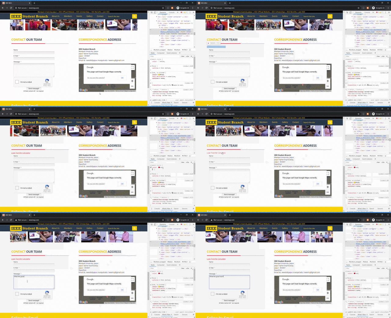
Piggyback backlink?
UI Design Critique
Here is a list of things I noticed —
Fonts
- Blues, Yellows, Whites, Greys, etc.
- Different font families (too many)
Spacing
- Spacing is off and often times too large or not consistent with other elements
- Overlapping sections
Flow of Content
- Does it make logical sense to be presenting certain elements/content in the order that they are?
- Poor quality images.
- For a first glance at the website, does it seem professional and legitimate? How could it be improved?
Responsiveness
- Not at all optimised for mobile.
- Use of default embed iframes making the website highly inconsistent.
Let's refactor
I was not able to refactor many things but only footer and the contact form. Also, advised changing yellow to orange tints because of it's perceived brightness. Also I told the team to use only two dominant colors say, blue and orange tints because pulling up complementary color schemes is comparatively easy than pulling up say, triadic color scheme.
Footer
Classic black tinted footer with clearly defined sections and thus eliminating social media panel entirely. (defunct email newsletter was to be removed)
Before refactoring —
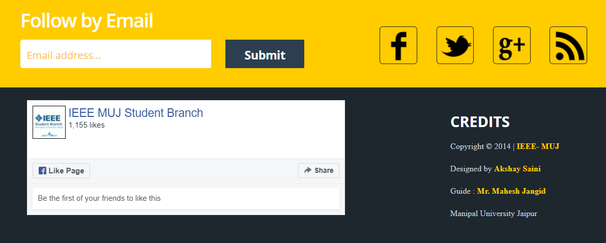
After refactoring —

Contact form
Before refactoring —
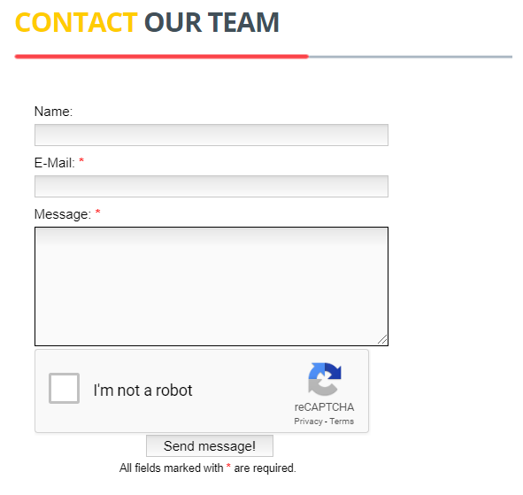
After refactoring —
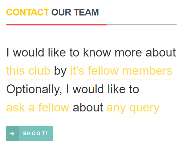
Attaching good quality videos of the weird shit I found, and preview of interactive form. Source code for the same can be grabbed, they're located here and here.
Signing off.
