Aroma of the Songs A.K.A. Project A.O.S. In The Making
Brief History
This story is about how I developed the project and what I learnt in the process of doing so.
I love music and frankly, who doesn't. From my childhood days, I have this innate tendency of tinkering things for example, from sending songs wirelessly using light, trying encoding songs visually to making machine generated synthetic songs, somehow music has always been a center piece to all of it. Aroma of the Songs follows this progression and transforms music into realistic looking roses creating exploration space of a unique kind — the one that helps you in connecting with music and impacts you on many levels.
Initially it was given the Project Codename S.O.S. meaning Smell of the Songs which then changed to Aroma of the Songs or Project A.O.S. because of the word 'Smell' being a little onto negative side.
What's Project A.O.S.
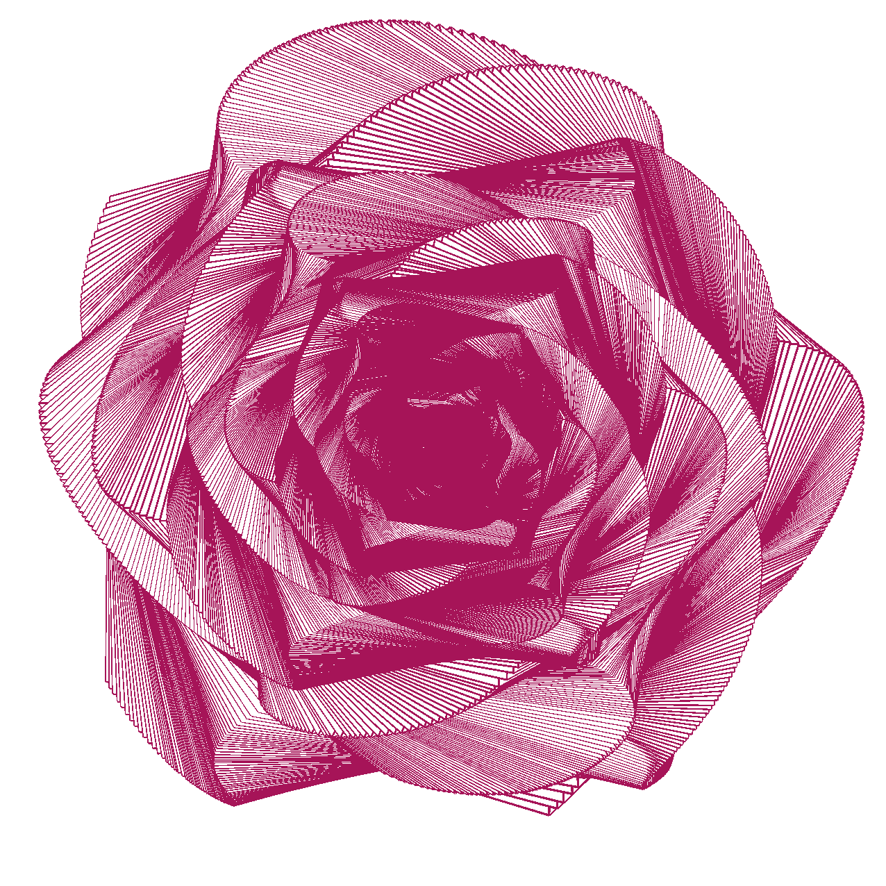
Aroma of the Songs helps in visualizing music in the form of intricate rose petals using moving cube traces. It uses fancy mathematical equations and FFT Spectrum Analysis to do so. I was interested in Generative art, a visual art genre and thus this project was born.
How Does It Work?
The algorithm behind this project manoeuvres the cube using a modified Rose mathematical equation and FFT Spectrum Analysis. The cube traces controlled by algorithm's core logic leave behind intricate & beautiful rose petals. The output by the algorithm is integrated with rendering engine called Processing which handles the movement of the cube. The source code was released and now resides over GitHub.
Looking Under The Hood
The source-code is public and you can easily go comb the code over 0x48piraj/Aroma-of-the-Songs. So, I'll explain the working in brief.
The core algorithm first loads the target song and computes amplitude values along the frequency domain. The array indices correspond to frequencies (i.e. pitches), from the lowest to the highest that humans can hear. Each value represents amplitude at that slice of the frequency spectrum. Returns an array of amplitude values (between 0 and 255) across the frequency spectrum. Length is equal to FFT bins (1024 by default).
Our algorithm then uses functions such as map() and constrain() along with many others for crafting the values to render the song as rose petals with changing color shades according to the song's melody.
The cube slowly shrinks in shape via defined variable which is dependent to the box's size which itself is relative to different screen sizes. After the box shrinks down to zero, it checks status of the current playing song, and, if the song isn't completed after one complete cycle, it resets the box and converts the rendered rose to an image using canvas.toDataURL("image/png") then appends the generated image to light-gallery for viewing, downloading, sharing, etc.
The proto equations which control the movement of the cube and create intricate realistic looking rose petals are,
rotateXorYorZ(cos(A * B)) and
rotateXorYorZ(sin(A * B))
The rotateXorYorZ() function defines the cube's rotating axes.
Building The Playground
A dedicated lab/playground was an obvious step. A place where users can tweak with parameters and see what happens, do little experiments to understand the project better.
And also, I wanted to make the project interactive just as a famous face generation project (now a startup?) called Generated Photos and thus the idea of building playground was born where users can generate roses of their favorite songs with their favorite colors.
Design Thinking
I took task-centered user interface design (TCUID) approach which included roughly the steps below,
- figuring out who's going to use the system to do what
- choose representative tasks for task-centered design
- steal (finding existing interfaces that work for users and then building ideas from those interfaces to satisfy the needs)
- rough out a design
- think about it
- create a mock-up or prototype
- test it (with users)
- iterate
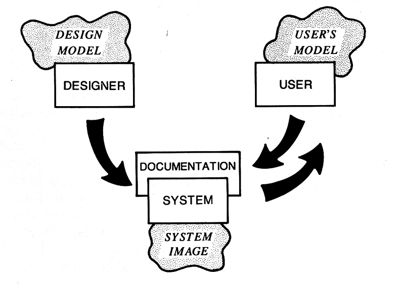
I developed few use-cases for getting hints on which features to implement. I wanted to create personas as well, but, then settled with taking dialogs (participatory design) from some of my technical & non-technical friends to minimize TCUID's weaknesses i.e. identifying values, connection, engagement etc. I wanted to keep designer's conceptual model pretty close to the user's conceptual model for building a functional system image.
Design Implications
I focused on formulating four design implications i.e.
- Sensitizing concept
- Abstraction and meta-abstraction
- Instantiation
- Prescription
The sensitizing concept (i.e. overall idea to keep in mind) of the project was to build an interactive system which will be easy-to-use. Abstraction and meta-abstraction were nothing but clarifying important abstract functionalities without noting specific technologies or methods and it included things like, making sliders for letting the users to tweak various parameters, letting users choose their favorite colors, songs, etc. Instantiation was thinking about possible design solutions and it's covered in the subsequent section. Prescription was about noting specific requirements for the solution to work i.e. being able to work on majority of the platforms including both mobiles and desktops, being able to render in all supported devices etc.
Prototype User Interface Design
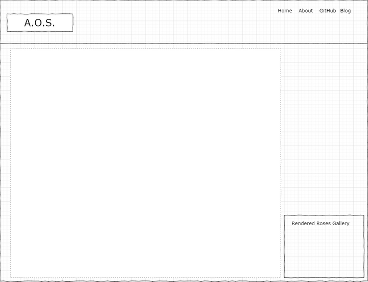
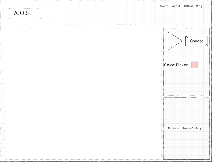
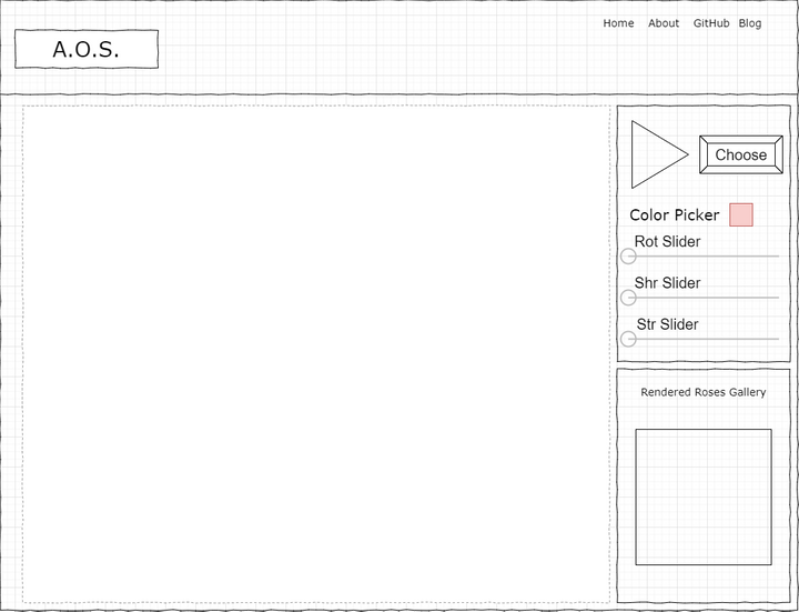
After combining all the formative work results, I started with whiteboard brainstorming sessions. Here's one of the final baked brainstorming outputs —
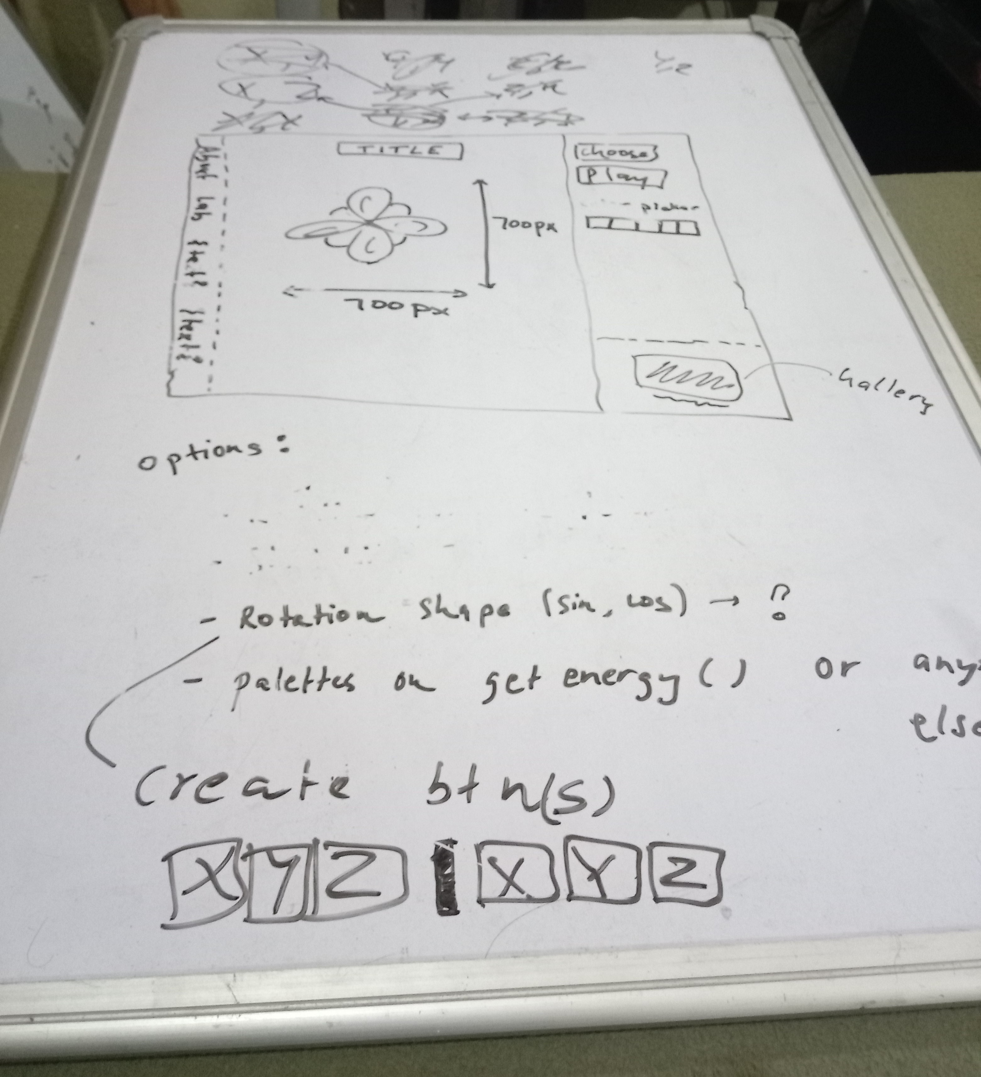
The initial wireframes —
Here's how the first implemented prototype looked like —
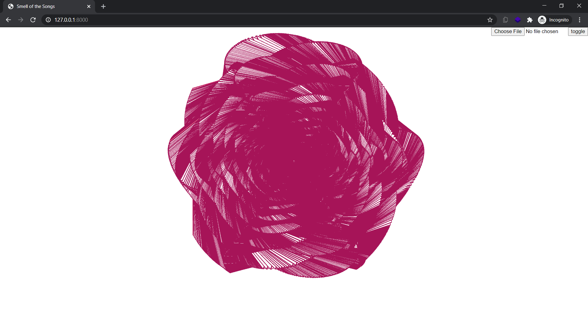
I used to redirect when encountered a mobile device but it doesn’t felt right so I started reading about detecting orientation change via events in JavaScript.
And now —
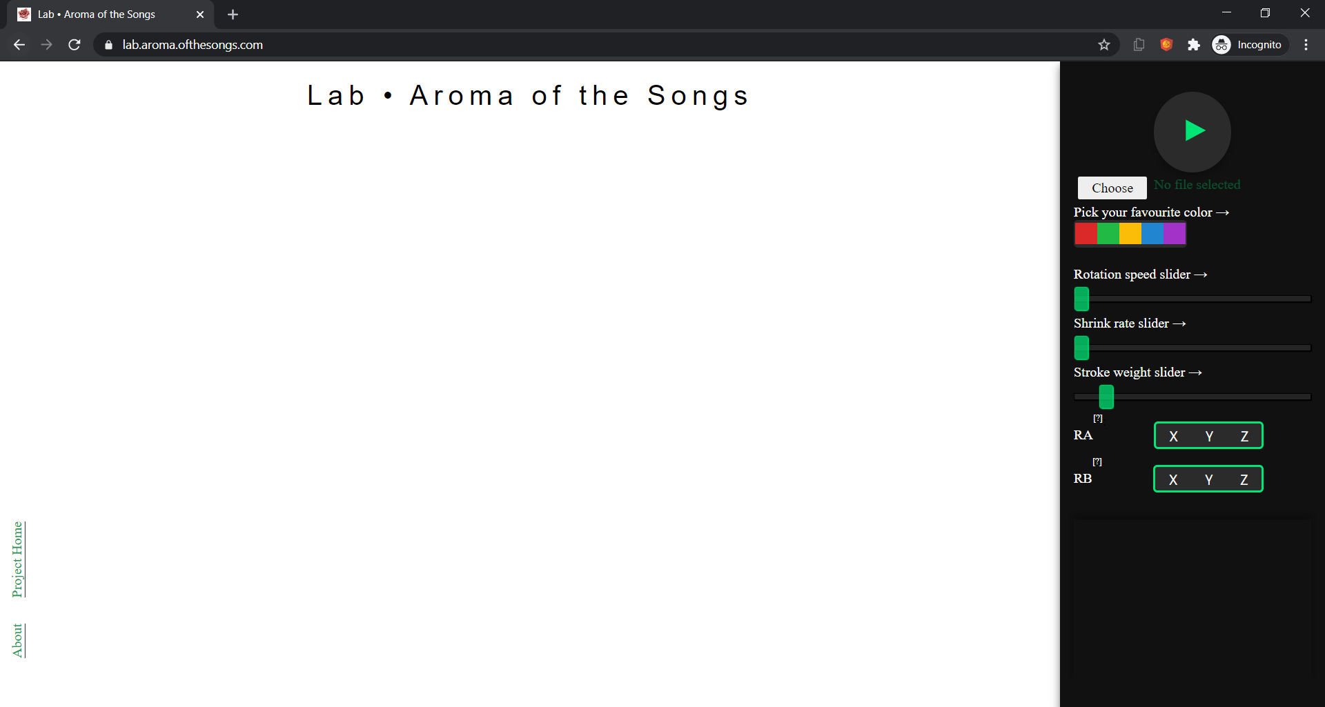
Applying User Interface Design concepts which I learned in various courses taught by Joseph A Konstan, Lana Yarosh with some others was both fun and practical. The project is still W.I.P. and I work on it occasionally.
